
MetaStock has been around a long time, but without the power of ValueCharts®, until now.
MicroQuant and MetaStock have recently partnered to bring the power of ValueCharts® and MQ Momentum to the MetaStock world. This creates a powerful combination that capitalizes on the best that both companies have to offer.

MetaStock has been around for over 30 years, and this welcome addition has been requested by many users. While MicroQuant’s ValueCharts® are available on most popular trading platforms, it’s only been recently added to
MetaStock. It capitalizes on the many capabilities that MetaStock provides, giving ValueCharts® users new features that haven’t been available until now. Users are already making great use of MicroQuant’s unique features in their trading, and now you can try it out, risk-free!
ValueCharts® is a patented technology that thousands of traders have used to give them insight beyond their regular charts. It’s been vetted by Ph D’s at the Wharton Business School, the University of Michigan, and the University of California as highly effective in determining valuation. Since it’s patented, the proven technology is only available through MicroQuant and their partners.
What makes ValueCharts® so special? It’s all about value.
You see, many people worry more about price when buying something, when what they should really be focusing on is value. If only price is considered in a trading decision, then we are setting ourselves up for a possible loss by paying too much for something. That is, without knowing the true value of something, we are buying based on price without knowing if what we’re buying is actually worth what we’re paying.
This is easily illustrated in the example of buying a preowned car. If we’re out to by a car, and we’re only worried about price, then we could just look at what someone is selling a car for to make a decision on whether or not to buy that car.
But it’s tough to know how much a car is worth just by looking at the price. Even if we know the make and model of the car, it’s still tough to know what a car is worth. In order to get a better understanding of the true worth of a car, we’re fortunate to have a guide that gives us an idea of what the car is worth. We refer to that guide, often called a “Blue Book”, to let us know how much the car should be selling for.
So, instead of just blindly going to buy a car based on what it’s currently being offered for, a wise buyer will know to refer to the Blue Book value of the car and see if the car is priced fairly. By using the Blue Book, we can immediately determine whether the price they’re offering the car is overpriced, underpriced, or fairly priced. If it’s underpriced, we can quickly buy it up, because it’s a great value. If it’s fairly priced, we can be confident that we’re paying a reasonable amount for the car. But if it’s overpriced, then we can walk away and wait for the price to drop, or negotiate the price down to a more reasonable amount.
Wouldn’t it be great if we had the same kind of tool available for stocks? We could look up a stock like IBM, or AAPL, or HD, and immediately analyze the value of the price it’s being offered at. Without it, how do we know if that’s a reasonable price for that stock? Are we paying too much? Is it at a bargain price? It’s hard to tell.
Like some unwise car buyers, many traders just blindly buy a stock without ever knowing its true value. But we want to be smarter than that.
You might be surprised that although a Blue Book for stocks might be something that would be in high demand, it’s not something that traders have on their desk.
That’s because, unlike cars, market prices are extremely dynamic. Traders understand that a market that’s overvalued can quickly become undervalued within seconds, rendering any printed book useless. It takes a dynamic approach to be able to keep up with the changing value behind a market’s price.
For example, let’s say a stock is approaching earnings, and just before earnings, what might that stock’s value be? Is it way overpriced on high expectations? Is it an underpriced bargain? And what about right after the actual earnings are announced? There’s often a huge move that accompanies earnings surprises, when in a matter of seconds, the underlying value of a market can change dramatically on the release of unexpected earnings numbers.
We need a tool that can clearly show value that’s as fast as the market to make sure that we’re keeping up with the current value.
And what tool can do this? ValueCharts®, of course! ValueCharts® will keep up with the value behind a market as fast as the data arrives. You can immediately know at any point whether a market is overvalued or undervalued.
ValueCharts® clearly identifies value through color-coded readouts that match up with the current price. So we can look at the price, and 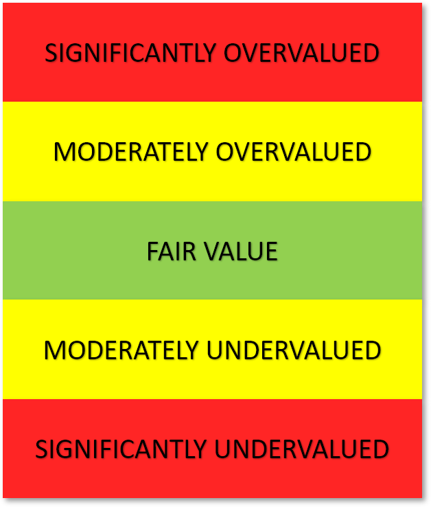 also see the current value. We can immediately know if the asking price is too high, and that we might want to wait before buying it. Or we could use that same data to realize that the value is high, and since it’s overpriced, it can be a great time to sell it. We can also know if it’s currently being traded at a fair price, which could be an opportunity to just hold onto the stock for the time being.
How Does ValueCharts® Depict Value?
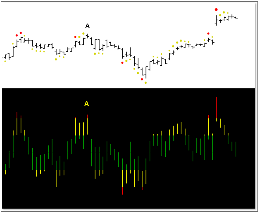
In the image shown here, you can see how ValueCharts® uses just 3 colors to depict value. Green represents Fair Value, which is neither over- nor underpriced. Fair-valued green is the middle, and we work outward from there. Yellow is used for as the moderate color, indicating when something is Moderately Overvalued or Moderately Undervalued. Red is used for the extremes, when price is Significantly Overvalued, or Significantly Undervalued.
ValueCharts® depicts these colors on a band beneath the price chart. Each price bar has a corresponding band on the ValueCharts® plot. The color bands we just referenced are mapped onto the ValueCharts® bars, as shown in this diagram. Notice how the value bands go into a red area at the top, indicating Significantly Overvalued prices. There’s also an opposite red zone at the bottom that indicates Significantly Undervalued prices. Similarly, the yellow areas represent Moderately Over- and Undervalued, and again, Green represents Fair Value.
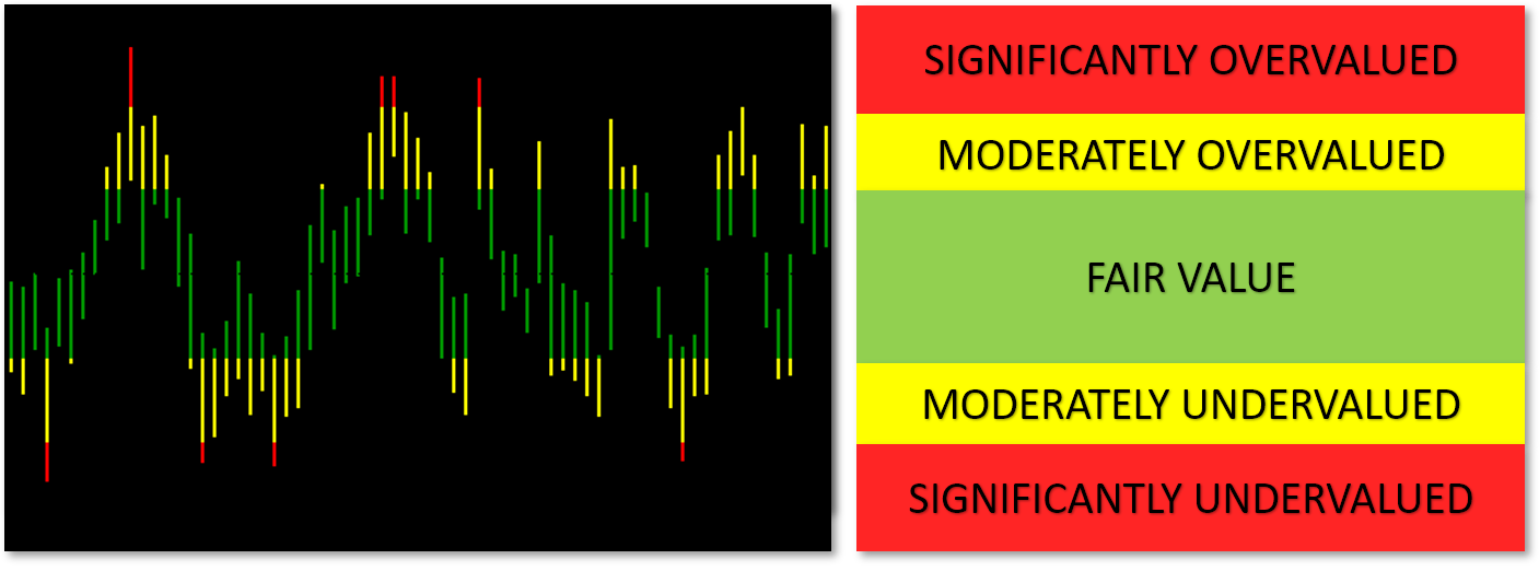
The color coding makes it easy to identify the extremes where value temporarily turns red. Notice how when it does so, there’s often a reversal back toward fair value, and perhaps even onto the extreme value on the opposite side of the scale. This is because value has a 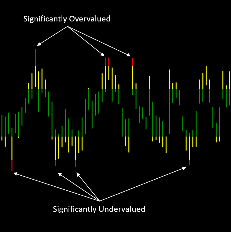 natural ebb and flow to it. Oftentimes, when price becomes significantly overvalued, price reverses and heads toward a more reasonable fair value. And sometimes it continues on to be valued in the opposite extremes. More simply, when we get a red bar at the top, price will often reverse and run to the other extreme.
This is powerful information, because it can help us identify great times to buy and sell. ValueCharts® plays a significant role in our evaluation because it lets us understand what’s happening behind price.
With ValueCharts®, we can match value to price and know when a price is too high, so we can avoid making that purchase. We can wait until a price is undervalued, indicating that we’re buying it at a point where it’s undervalued, and more likely to increase in price. And if we’re holding a position, having ValueCharts® in the red Significantly Overvalued zone can indicate a great selling point.
And here’s a great feature of ValueCharts®. It works on all timeframes and on all markets. So you can look for convergence of value on higher time frames as an even stronger signal to influence your trading. For example, if your market is Significantly Undervalued on the Weekly chart, you can make repeated buys on lower timeframe charts knowing that the longer-term value bias is undervalued. That is, you can find precise opportunities to buy more on the short timeframe chart, knowing you have the longer-term bias in your favor.
Some of you might be skeptical that this tool is going to provide valid value information. The creators of ValueCharts® wanted to make sure that their patented solution actually does work even when markets are quickly moving, so they reached out to some of the best business PhDs in the country to have them do a thorough evaluation of ValueCharts®. PhDs from the Wharton Business School, University of Michigan, and the University of California, Los Angeles all agreed that ValueCharts® is highly effective in determining valuation in dramatically changing market environments. So not only is ValueCharts® patented technology, it’s proven technology. And proven not just by experts at leading universities, it’s also proven by the thousands of traders who use ValueCharts® in their trading every day.
Here’s what ValueCharts® looks like when mapped below price bars. Again, each ValueCharts® bar corresponds to a price bar. Notice how value peaks often correspond to price peaks, and even more importantly, how ValueCharts® often helps us identify the price peaks of a market. ValueCharts® plots in real time, so at the time price is reaching a peak, ValueCharts® is already lettings us know it may be getting too high, and that price is likely to reverse. You can see an example of this at point A in the image.
MetaStock Makes It Even Better
MetaStock makes ValueCharts® even easier to use. You may have noticed colored dots above and below the price bars. The dots show the Yellow and Red ValueCharts® values right next to price. This makes it much easier to associate value to price. When dots appear below price, they represent the undervalued colors. Above price, the dots represent the overvalued colors. And the more extreme the color is, the larger the dot, as can be seen with the very large red dot at the top right, were we were at a value extreme.
We had such a value boost at that value extreme, it’s not surprising that we needed to wait for value to return to normal, as shown on the ValueCharts® plot. This is reflected by price moving sideways for several bars to let value return to normal at this new high. It’s not surprising to see a consolidation like this after such a large move, and ValueCharts® is letting us know when we’re back to Fair Value to “reset” for potential further moves.
Momentum and Value
And not only does the ValueCharts® package include the ValueCharts® functionality, it also includes other valuable components designed to work hand in hand with ValueCharts®. The next component is something that all of us at Basecamp Trading have on all of our charts. That’s right – every time frame, every market.
It’s MQ Momentum, as shown here. We recently featured our MQ Momentum indicator in another article about “Trading with a Ferrari”. That’s because the performance of our MQ Momentum indicator is the best that’s out there. When we’re looking for an indicator that will 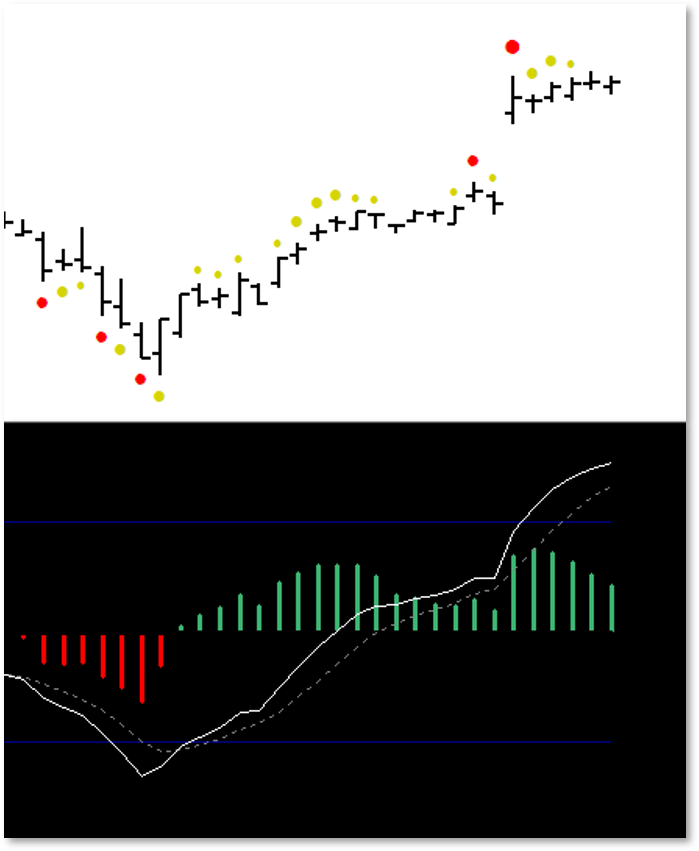 reveal the momentum behind a move, we need it to tell us as quickly as possible, and as clearly as possible. And that’s what MQ Momentum gives us.
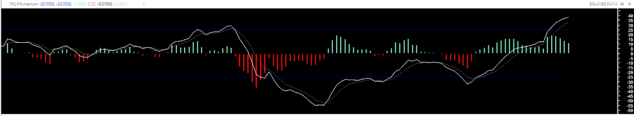
In this image we can see Price bars with the corresponding MQ Momentum indicator mapped below. The solid white momentum line represents the speed and direction of the market, while the red and green histogram bars reveal the power behind a move.
When we see the white line put in a bottom and reverse back up, it’s confirmation that price will continue to move in that direction. Look how quickly the histogram bars changed from red to green at the reversal point to indicate the power growing behind the bullish move. Notice too that the white momentum line continued to point upward even as the power behind the move was fading just a bit, letting us know that in reality what we were seeing was a pause and a recharge before the larger jump. Our histogram bars stayed green throughout, and even gave their own indication that there was energy building up before the move.
It’s All About What’s Happening Behind Price
You may have already realized what MQ Momentum has in common with ValueCharts®. They both reveal what’s happening behind price. They let us know in advance what’s happening so we can act before others, giving us and added edge. Plus, they give us the confidence to enter into new trades, knowing that we’re buying at a bargain price. And we have equal confidence when we sell, knowing that we’re closing our position at a high-value point before a pullback. We can do this with confidence because we can now know the value and the market direction, thanks to ValueCharts® and MQ Momentum.
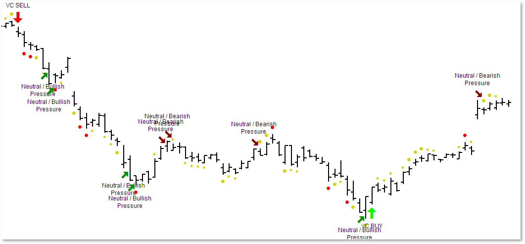
But we don’t stop there. MetaStock gives us even more ways to use these wonderful tools. Our Trend Ribbon, seen here at the bottom of this image, reveals when we’re in a bullish period or a bearish period, based on continuous evaluation of our methodologies. And do you notice anything else in the image?
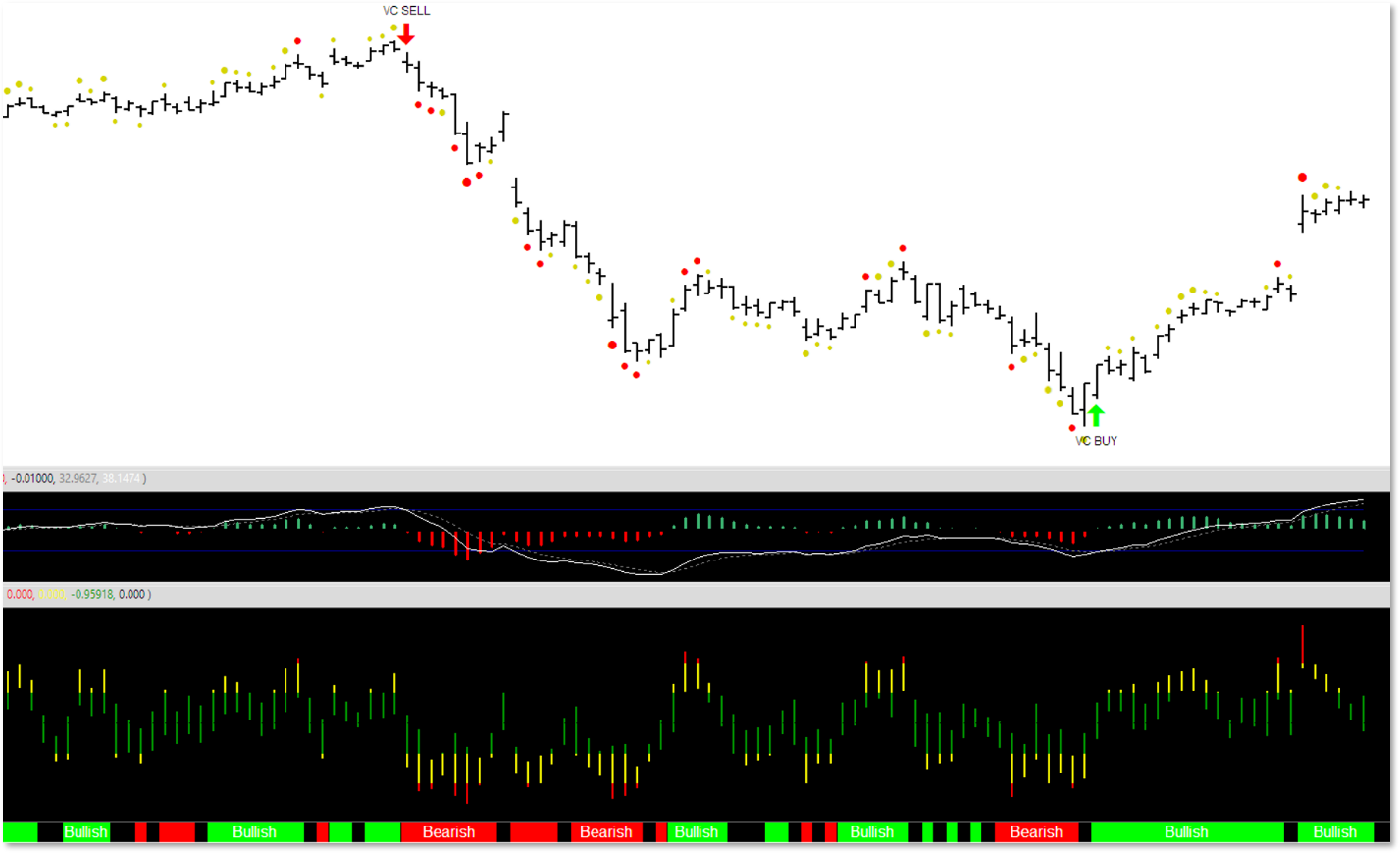
If you look closely, you’ll see another one of MetaStock’s truly awesome features, and that’s Buy and Sell indications, printed right on the price chart. If you look at the highest and lowest points of this image, you’ll see the VC Sell and VC Buy indications, that use ValueCharts® and MQ Momentum in combination to identify potential entry and exit opportunities.
Remember, these are all continuously updated, and are made available in real time so traders can take immediate action with confidence. But we didn’t stop there. We also provide “pressure” indication, right on the chart. These pressure indications reflect periods where we anticipate bullish or bearish pressure that can either pause or reverse a market. They’re not as clear of a signal as a VC Buy or VC Sell, but they can often give amazingly accurate bias, as you can see in the image.
Get Up to Speed FAST
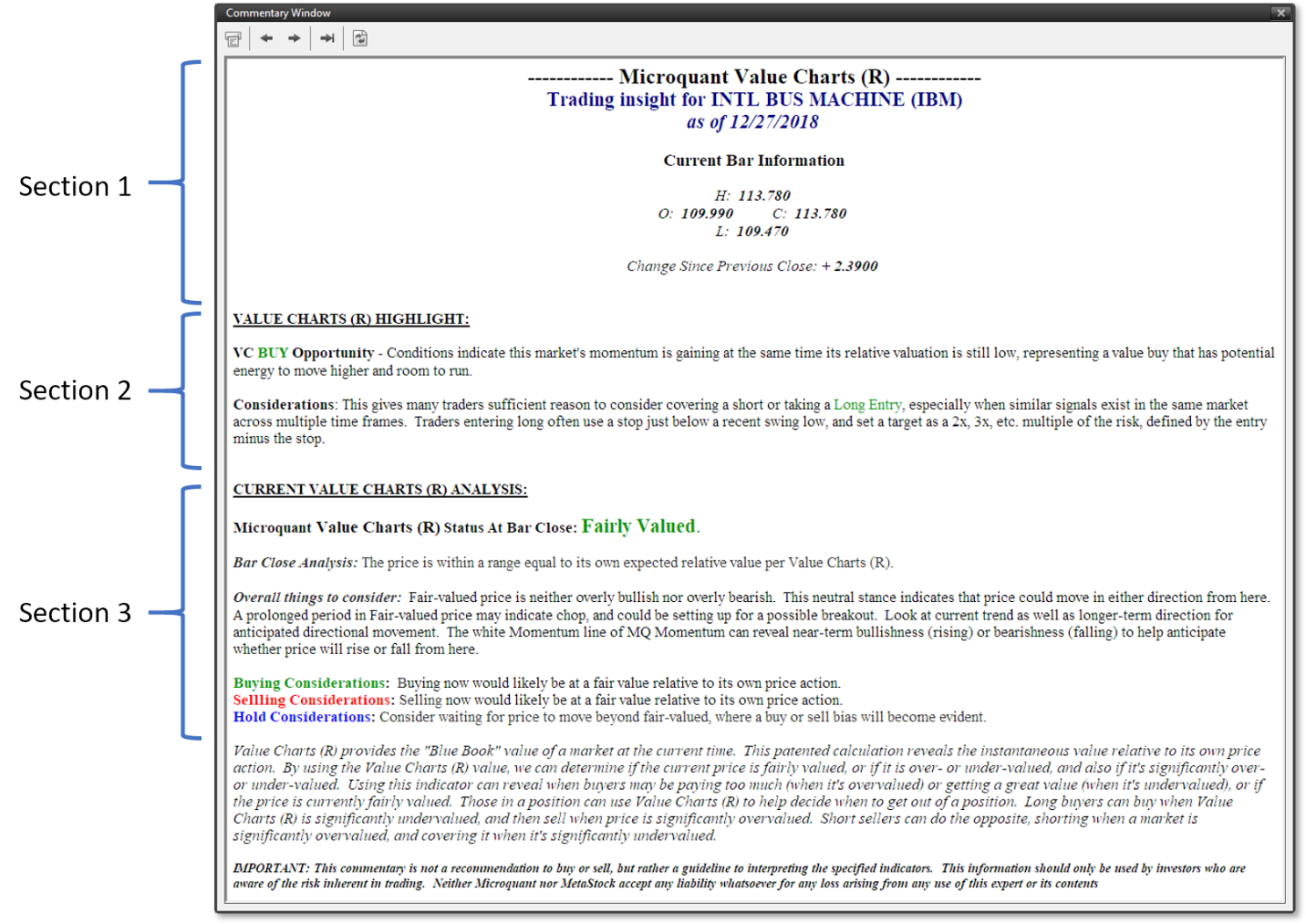
And for those that like even more guidance in understanding the signals, we’ve taken advantage of MetaStocks Expert Advisor functionality, to present analysis and actionable instruction and guidance on every single bar. This is great for someone who prefers more than just a signal on a chart, and it’s a great way to quickly come up to speed on the tools, or even just confirm your own chart analysis.
We present the Expert Advisor data in three sections: 1) Market Details, 2) Buy and Sell Considerations, and 3) Value Considerations. This is one of the amazing features that are unique to MetaStock, and already built into the MicorQuant ValueCharts® Complete Suite toolset.
Scanning with the Power of ValueCharts®
And if that weren’t enough, we have taken it a step further. We’ve built the intelligence of our patented tools into MetaStock’s Explorations Toolset. This allows you to search for ValueCharts® -based setups across all kinds of markets.
Want to know which NASDAQ stocks are currently Significantly Undervalued and perhaps ready to jump higher? Want to find a list of which stocks currently have a VC Buy recommendation? Scans are ready to go so you can look for opportunities across all of your favorite markets with speed and simplicity.
Every day, you’ll know which of the markets are prime value candidates for a buy, and which are likely ready to sell. These narrow down 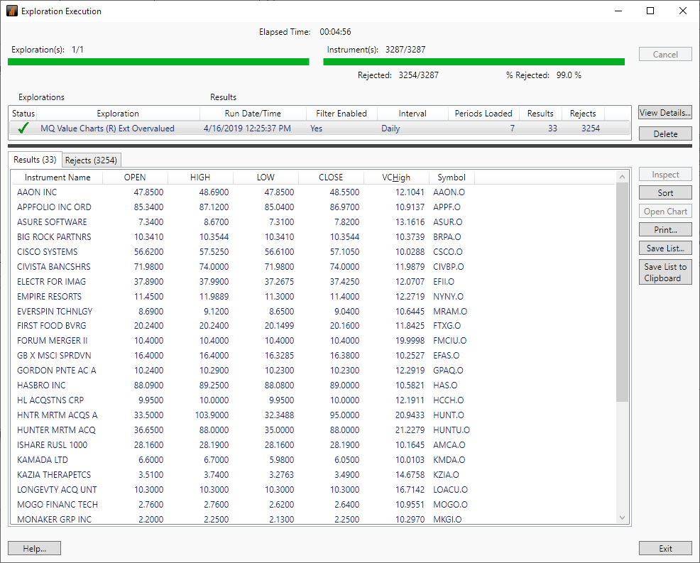 your list and make great starting points in your analysis to help you decide which trades you’re ready to examine for action.
The Complete Suite
As you can see, this is a complete suite of the essential tools that look behind the often-misleading price so you can know a market’s value. It’s time you were able to trade with confidence! It’s patented technology, that’s only available from MicroQuant, and it’s now available on MetaStock. And you can try it out risk-free with MetaStock’s 30-day Money Back Guarantee. So there’s no need to wait any longer. Get your copy now at a great introductory discount – available for a limited time. Act fast! This low price won’t last forever. Why trade another day without knowing the value behind market prices. Get yours now!
Want even more information about ValueCharts® on MetaStock? Here’s a video by MetaStock’s Jeff Gibby showing many of the features of ValueCharts®. And remember, you can try out ValueCharts® risk-free, today!
Share Your Thoughts Below
Recent Related Articles


0 Comments