
Renko Charts have been getting more attention lately, and it’s no wonder.
Many traders have recently used Renko charts to turn their trading around to make consistent and significant gains. So what are Renko charts and what makes them so different?
Renko charts provide a new way to display price movement, compared to traditional time-based charts. In fact, the key thing that Renko does is filter out the noise of the market. By noise, we mean the small ups and downs that are not strongly aligned with the larger moves.
With Renko, we can streamline our charts, because what we see is a chart that more clearly shows the trend. And of course, we all know that trading with the trend in mind is one of the most important things that many successful traders rely on. Renko charts also make channels much more evident, which makes it much easier to identify breakout points for your trades.
Since Renko charts make it easier to see trend and where the breakouts occur, it lets you focus on the critical turning points in trading so you can capture the big explosive moves.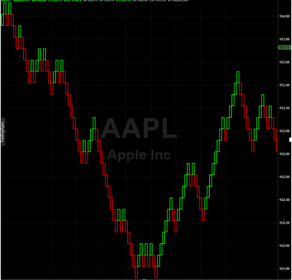
Here’s an example of a Renko chart on AAPL, as shown in this chart image.
As you can see, Renko charts look quite different from other charts you might be used to. So what makes a Renko chart different from other charts?
Renko is really a derivative of normal charts, which is a fancy way of saying that they’re built on top of the regular price data that you’re used to seeing. Rather than just charting price over time, Renko charts can reveal the movement of a market, independent of time. Our charts then become more focused on movement relative to itself, without concerning ourselves with time-based periods.
That can confuse some people, because time is still plotted on the bottom axis of Renko charts. But it’s not time that causes a new bar to be created, as it would on a 30 minute, daily, or any other time-based chart. Upon close examination, you’ll notice that time on the bottom axis is not evenly spaced on a Renko chart as it is on a time chart.
With a regular time-based chart, a new bar appears for each time interval. On a 30-minute chart, you’ll see a new bar every 30 minutes while the market is open – whether the market’s price moves up, or down, or even if it doesn’t move at all. Same thing with a 2-minute chart, where a new bar will form every two minutes even if price stays about the same.
This can actually mask activity, because a market can have a huge move and still have just one bar.
You can likely visualize how a single 30-minute bar captures the entire movement of the first half-hour of the trading day, not revealing the up and down activity that occurs within that bar, aside from the open, the high, the low and the close.
Renko will reveal all the significant movement within that bar as it rises and falls, using as many bars as it needs to. It clearly reveals exactly what’s happening on a macro level.
The Mechanics of a Renko Bar
So when do Renko bars get created? Renko bars only form a new bar when price moves by a specified amount. A new Renko bar is drawn when price moves that amount in a given direction. Precisely when a bar is plotted is independent of time. It may take a fraction of a second to form a new bar, or it may take minutes, hours, or even days or more. It just depends on price moving beyond the range of the previous bar.
We often call that required movement amount the “brick size” because it also defines the height of the standard Renko bar that’s drawn. In fact, it’s thought that the name “Renko” is derived from the Japanese word for brick, which is “renga”. Like Japanese Candlesticks, Renko bars were developed by the Japanese.
If we have a brick size of 10 cents, a market needs to move 10 cents to form a new brick. The chart above shows AAPL with a 10-cent brick size. Each brick, or box, represents 10 cents of movement. If price moves up or down by 9 cents or less, then no new bar is drawn. If it moves up by more than 10 cents, a new bar is drawn above and to the right of the current one. If price moves more than 10 cents to the downside, then a new Renko bar is drawn below and to the right of the current bar. Each new bar drawn will have a height of the brick size, or 10 cents in this case.
Note that your brick size unit is defined by the market you’re trading. In equities, it’s likely specified in cents. In Forex, your brick size may be in pips. In Futures, you may specify it in terms of ticks. And this can vary by platform as well. For example, in Tradestation, Futures Renko settings are specified in decimal amounts, while NinjaTrader users can specify them in ticks. Regardless of the market or platform, it’s usually a function of the smallest amount of movement the traded market supports.
And does color matter? Yes! Up bars are usually green or white, down bars are usually red or black. This makes it even easier to know when we’re in an upward moving bar series, or a downward moving bar series. In the chart shown above, you can easily distinguish the green bullish runs from the red bearish runs, and you can clearly see the temporary pullbacks in price with mid-run color changes.
Renko Simplifies Chart Reading
OK… So you now have an idea of how Renko bars get formed. So what’s the big deal? Why do Renko bars make it easier to trade?
Here’s the key: Renko bars only get drawn when price moves by a significant amount. This is how it filters out the noise. Renko charts don’t bother showing all the little up and down moves that are less than the brick size. Only significant price moves are reflected in the standard Renko chart.
This way, you can concentrate on the significant moves in the market so you can more clearly see entry and exit points. When it does form a new bar, you can begin to identify the more significant breakouts, when we’re trending vs consolidating. All the other “noise” gets filtered out.
Let’s take a look at how that filtering appears in the chart, and how it creates clarity. Here we show a side-by-side comparison of a standard Open High Low Close (OHLC) time chart and a Renko chart over the same trading period.
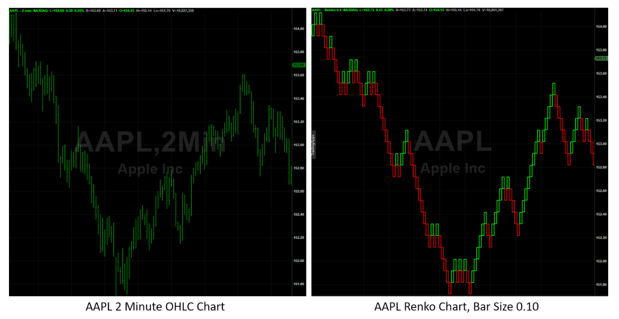
The first thing most traders notice is how color is added to identify trend direction. Many traders find this alone to be of great assistance in adding clarity, as it can immediately identify trend direction. Look how it clearly shows that we’re in a downtrend when we see several bars of the same color in a row. When color changes back and forth from red to green, it’s clear we’re in a period of consolidation.
Also, notice the confidence in direction once a trend gets underway. It becomes more obvious where we’re breaking out of a consolidation zone and into a trending phase.
Even more importantly, as we’ve been pointing out, there are a lot less lines on the chart in the Renko chart than there are in the OHLC chart. As price moves back and forth within a small range, the Renko approach absorbs a lot of that non-productive movement, and reduces the number of bars it creates. It smooths out the chart to let you focus on what’s behind price: that we’re in a consolidation period and we’re awaiting a breakout. Once we have the breakout, it’s easy to identify that we’re leaving a channel area, and the movement of trend is clear.
And Renko charts will help you identify the upper and lower breakpoints of the consolidation zone, so it becomes even more obvious when we’re breaking out. Many traders use these consolidation zones over longer time periods to find areas where price may find support or resistance based on past movement. Renko charts help to make these longer-term and more significant price points that much easier to see.
Renko charts can also be compared to candlestick charts. Here’s the same chart, this time comparing candlesticks to Renko. Again, look how Renko lets you clear away a lot of the minor movement to let you focus on consolidation zones and trend breakouts.
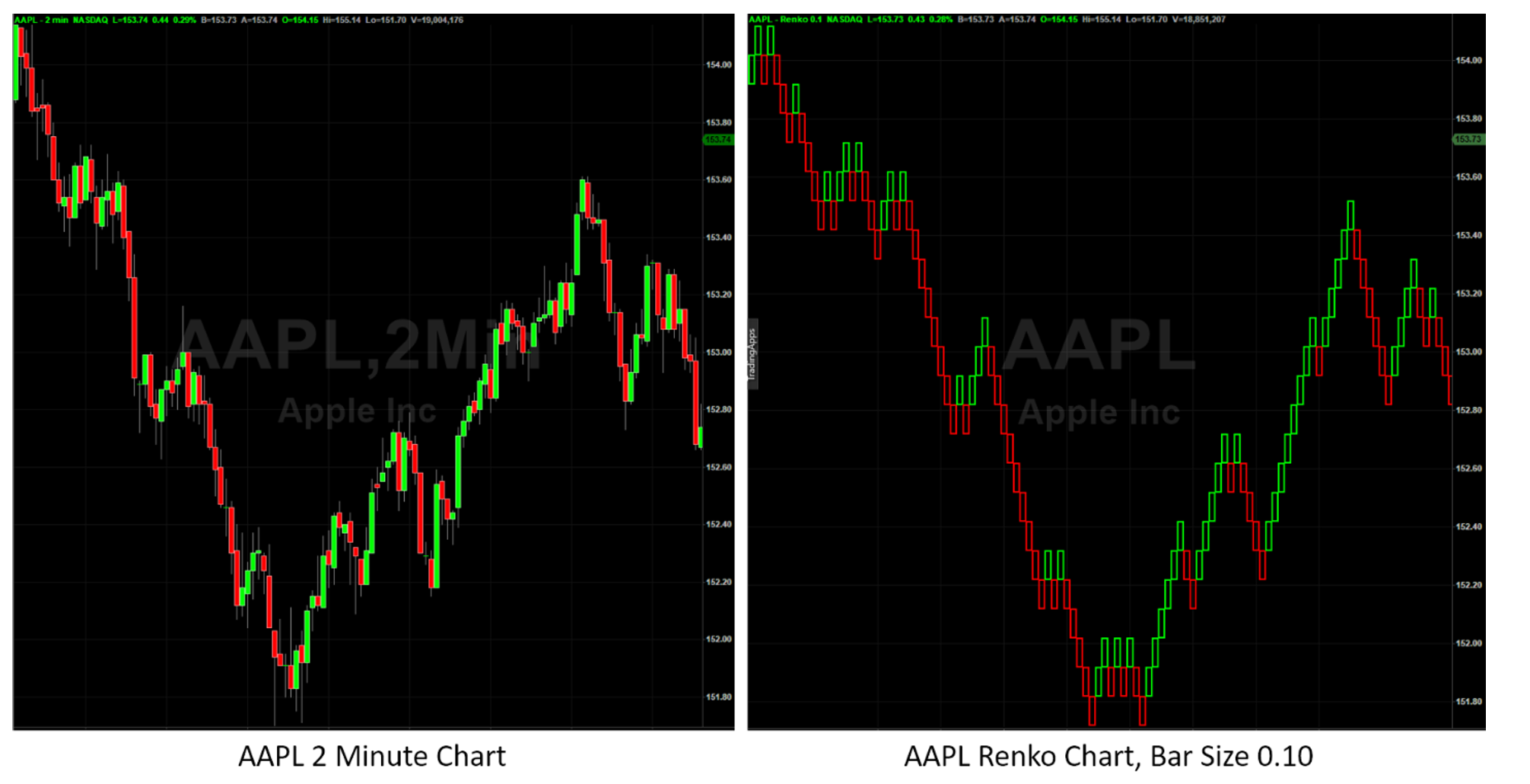
The Renko chart captures the movement and tames it so you can feel more in control of price action.
And there’s no reason you can’t use the two in combination. While candlesticks can reveal the intricacies of price action, you can bring up the same chart with Renko to make sure you’re focusing on the big picture to take advantage of the larger market moves.
If only we could combine some of the benefits of both candlesticks and Renko into a single chart… (You certainly can! Let me explain how…)
More than One Type of Renko
So far we’ve shown you how Renko bars are formed, and how they provide clarity to access the biggest, most powerful market moves. Now let’s discuss how Renko variations can provide you with additional insight into Renko price action.
Up to now, we’ve only talked about the standard Renko bars. There are several additional types of Renko bars.
For example, “Mean” Renko bars are similar to standard, but instead of placing the new bar above the previous bar, the bar is placed at the mean, or middle of the previous bar. While this sounds like a relatively small change, it has another feature. A feature that’s a huge advantage.
Mean Renko bars have wicks.
That is, when price moves in a direction, but then reverses and goes the other direction, it leaves behind a “tail”, or wick, as candlestick users refer to them. These tails can reveal indecision, just as they can in candlesticks.
Take a look at the image here that shows the original standard Renko chart we showed earlier, with a similar Mean Renko chart over the same period. Notice how we can still clearly identify the consolidation and trending zones with clarity, but we can also now see wicks that stand out at the reversal points.
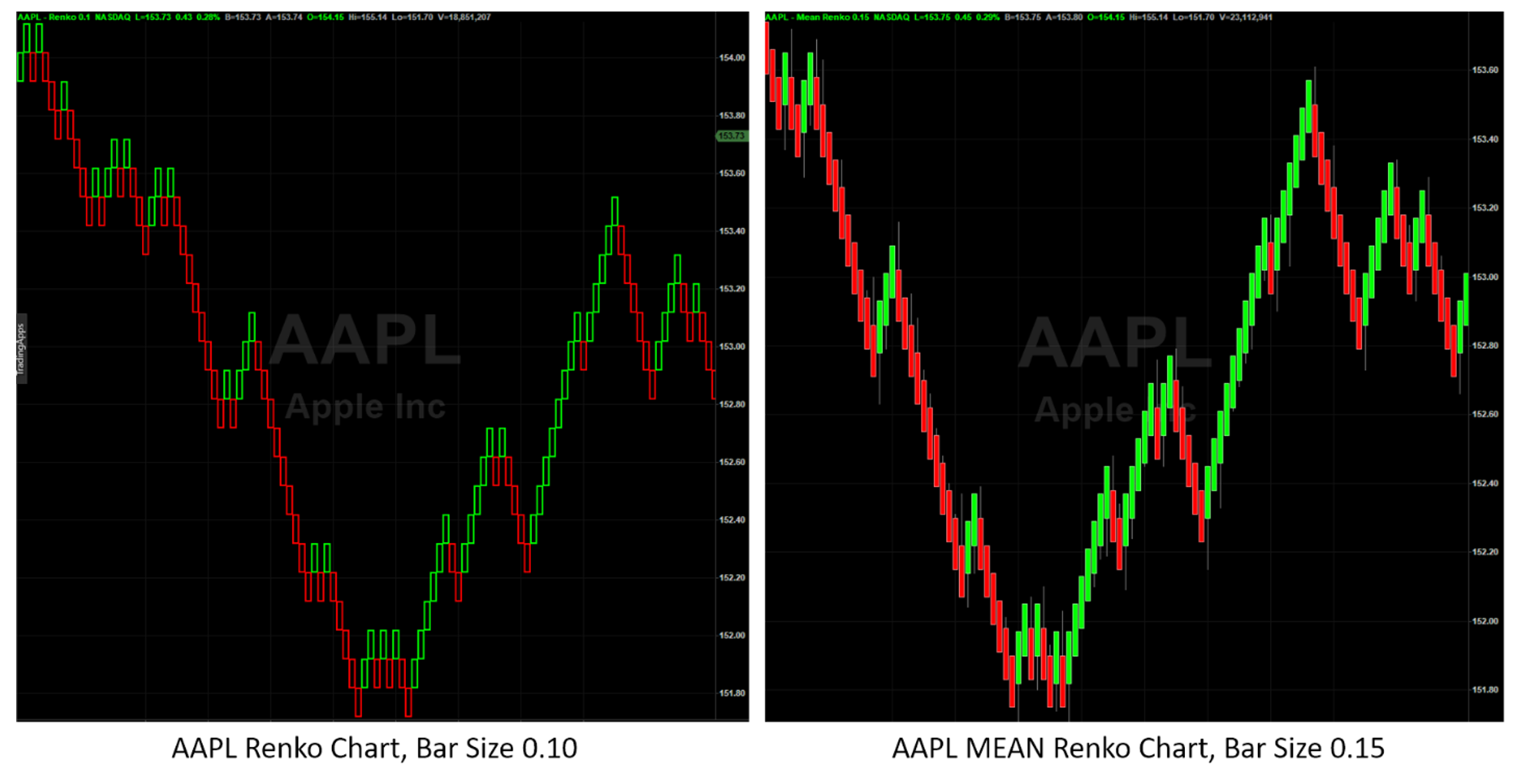
These reversal points give us the insight into the indecision that price experiences at it reaches a potential pivot. That is, as price develops, and we’re not quite sure if we’re about to form a pivot, a wick gives us that extra piece of the puzzle that gives a possible heads-up that we’re about to reverse. That is, that we’re about to get a Renko pivot.
If we can identify the pivots early, then we have the opportunity to jump into a trend earlier, closer to the start of the trend. That means we can take more profits out of the market on a run. And those profits add up. What would another 10% or 20% additional profit on each run make to your account? And remember, it’s not just knowing the best entries to grab, it’s also about knowing when a trend is about to end, giving insight into the optimum exit as well as the entry, so you can capture any gained profits before price pulls back.
It’s the best of both worlds this way, having not only Renko bars that show you the explosive moves, but also identify the key points of indecision which can flag key turning points that make entry and exit precision possible.
Now not every wick is going to result in a tradeable pivot. Sometimes they signal small reversals, while the major trend is still underway. The occurrence of a wick mid-trend often indicates a temporary pause, as if the market takes a breath before it continues on its original trend. And yes, these can be used to identify entries, even if you miss the initial breakout.
That’s right. Wicks not only help you identify the major turning points in the market, they can also give you the opportunity to jump into a trend after it’s already started without you.
And if you were already in the trade at the start of a trend, a mid-run wick is a great time to add to your position.
This is where we start to get the truly explosive moves. With the clarity of Renko trend identification, combined with the insight of wicks, you are armed with the knowledge of what’s moving and when to move, and perhaps most importantly, ahead of many other traders. Every edge like this you have in your toolbox increases your odds of success.
How to Get Started With Renko Trading
This all might look quite easy, and it certainly does simplify trading when done properly. The real test is when you’re looking at the right-hand side of the chart, when the next bar is unknown. That’s when you need to decide whether to enter the next trade.
We can build further on our confidence by bringing in some additional indicators that we use in concert with our Renko charts to give us even further clarity to get the right entries and exits. Even simple indicators such as moving averages can be combined into a proven system that many traders are learning right now and building their accounts in ways that are surprising even seasoned traders.
Take a moment to watch this free training that will show you more about trading Renko, including which indicators can help provide the additional insight to build upon the clarity of Renko charts. You’ll learn about several other types of Renko bars, and it even includes a surprisingly simple strategy so you can start trading Renko today.
To learn more about Renko charts, and how to use common indicators to simplify entries with a systematic approach, watch this free training right now, while it’s fresh in your mind, and begin to reap the benefits of the clarity, precision, and explosive gains that so many Renko traders are already enjoying.
Recent Related Articles